
 LLM
LLM VIDEO
VIDEO SPEECH & MUSIC
 Intelligence with everyone
The Starting Point
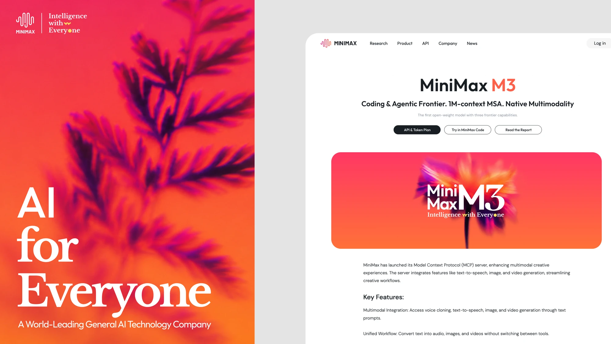
“Vitality” serves as a core visual language, continuously expressed across brand touchpoints to create a distinctive and recognizable visual identity for MiniMax.
“Vitality” serves as a core visual language, continuously expressed across brand touchpoints to create a distinctive and recognizable visual identity for MiniMax. MM’s visual identity is inspired by five key attributes: Nature, Life, Growth, Vitality, and Motion. By connecting technology with the natural world, we incorporate dynamic organic forms found in nature into the visual system, expressing a sense of continuous growth and living intelligence.
Logo System
The visual cornerstone of the MiniMax brand — symbolizing rational order and creative tension.
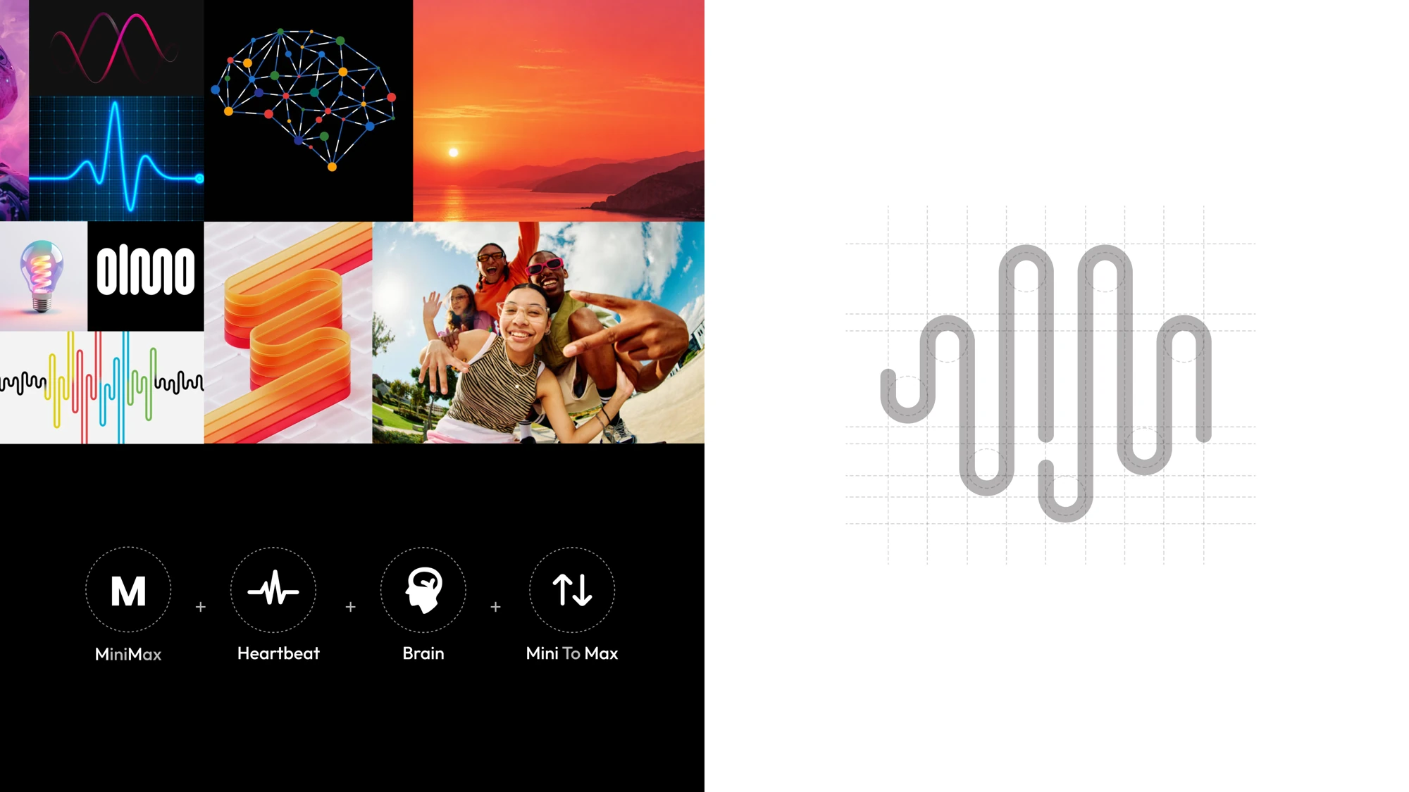
Welcome to the MiniMax Design & Brand System. This system defines the core foundation of how we connect with the world. In an era of rapid AI evolution, clarity, consistency, and scientific humanism serve as our greatest strengths. This system encompasses the core building blocks of our visual identity, ranging from logo guidelines and structured grids to typographic principles.
Our Logo
The MiniMax logo is an important visual identifier of our brand. It communicates our company’s core values and sets the stage for all messaging and communication that follows.
The MiniMax logo should be used to identify the company in external communication materials to maximize our visibility and to maintain the singular, iconic look with which our audiences identify.
Official Slogan
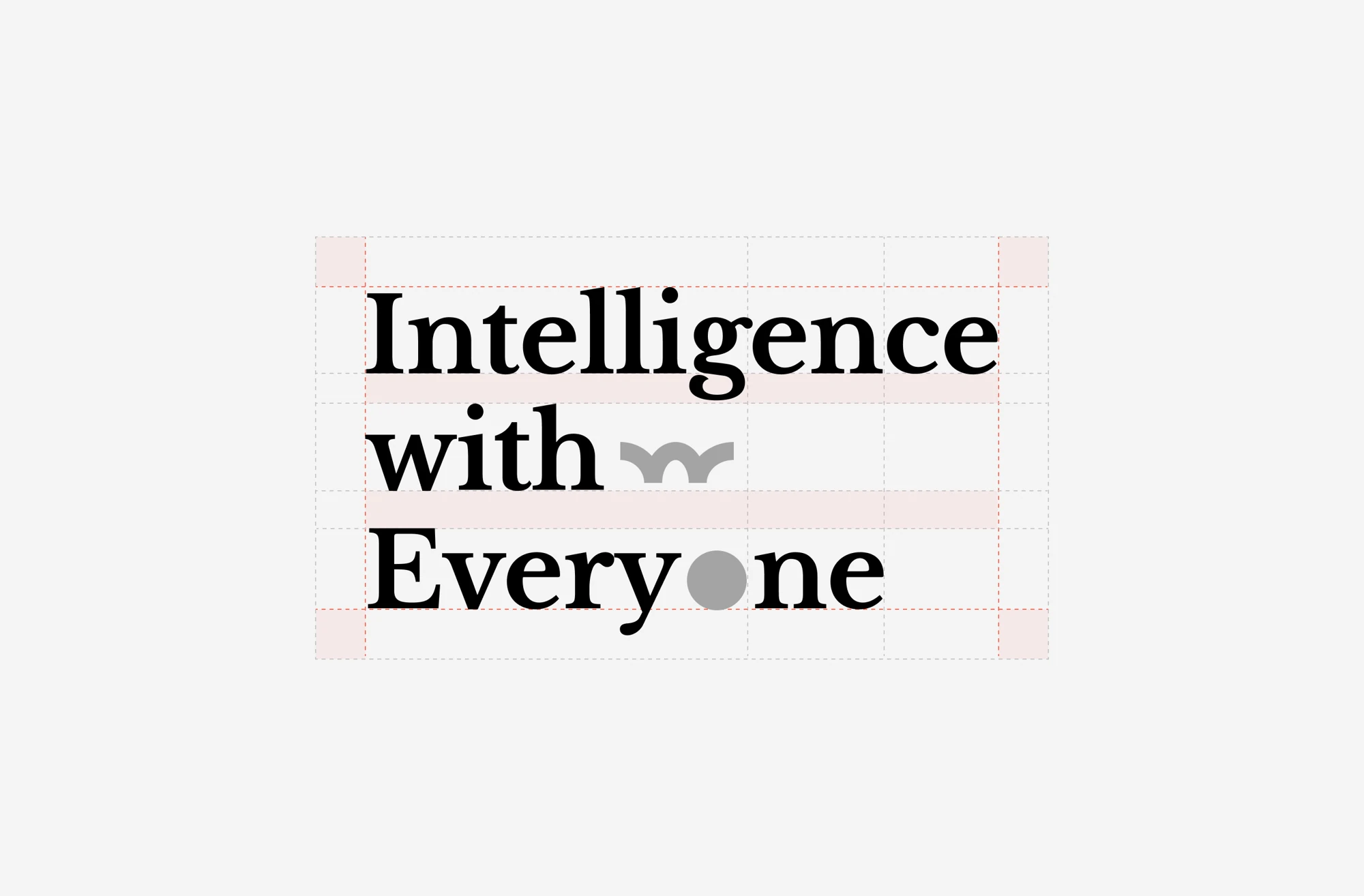
Our Official slogan:
【 Intelligence with Everyone 】
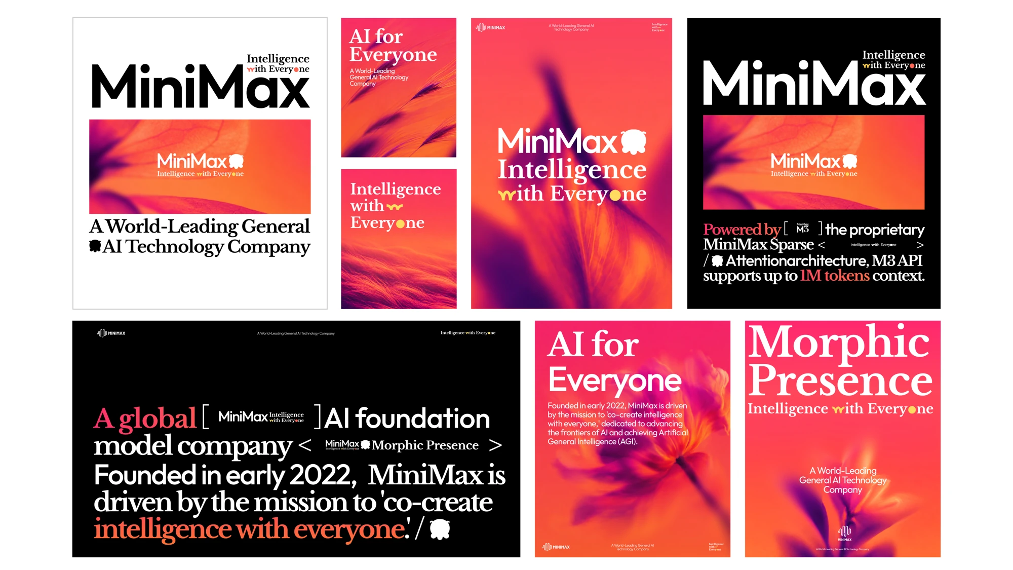
The official use of the slogan must strictly follow the diagram. Currently, only four layouts are allowed, of which one is the most official and most used.
Color System
The gradient system is a defining element of the brand identity. It reflects the balance between creativity and technology while adding depth, vibrancy, and consistency across every touchpoint. Use the official gradients exactly as specified in this guide.
Typography & Layout
The brand typography system is built around three type families: Libre Baskerville, Outfit, and DM Sans. Together, they establish a clear typographic hierarchy and a consistent visual identity system.
Brand Identity Assets
Select vibrant plant and animal forms that embody vitality and energy. Transform them into highly dynamic expressions across both static and motion contexts — capturing moments of growth, blooming, movement, wind interaction, and active evolution.
Try Our Assets
/Prompt
【Life Form】, close-up soft focus macro photography, dreamy atmosphere, abstract natural aesthetics, delicate organic form, translucent texture, gentle movement, blurred edges, 【orange-red to purple gradient background】, soft glowing light, soft diffusion, shallow depth of field, cinematic glow, ethereal background, minimal composition, poetic and elegant, high-resolution fine art photography, sense of vitality
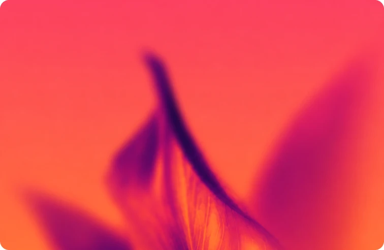
Explore examples created with the generator.


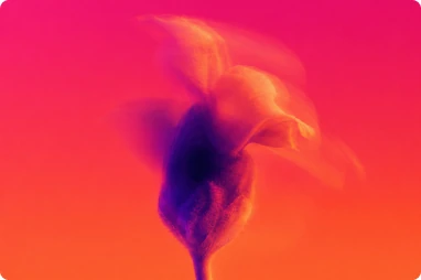




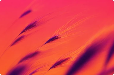
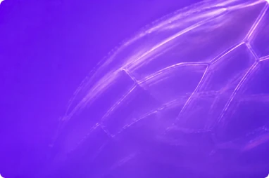


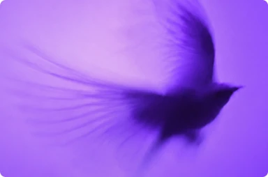


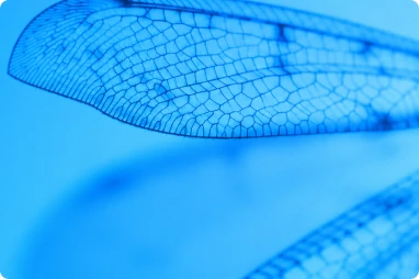

Illustration System
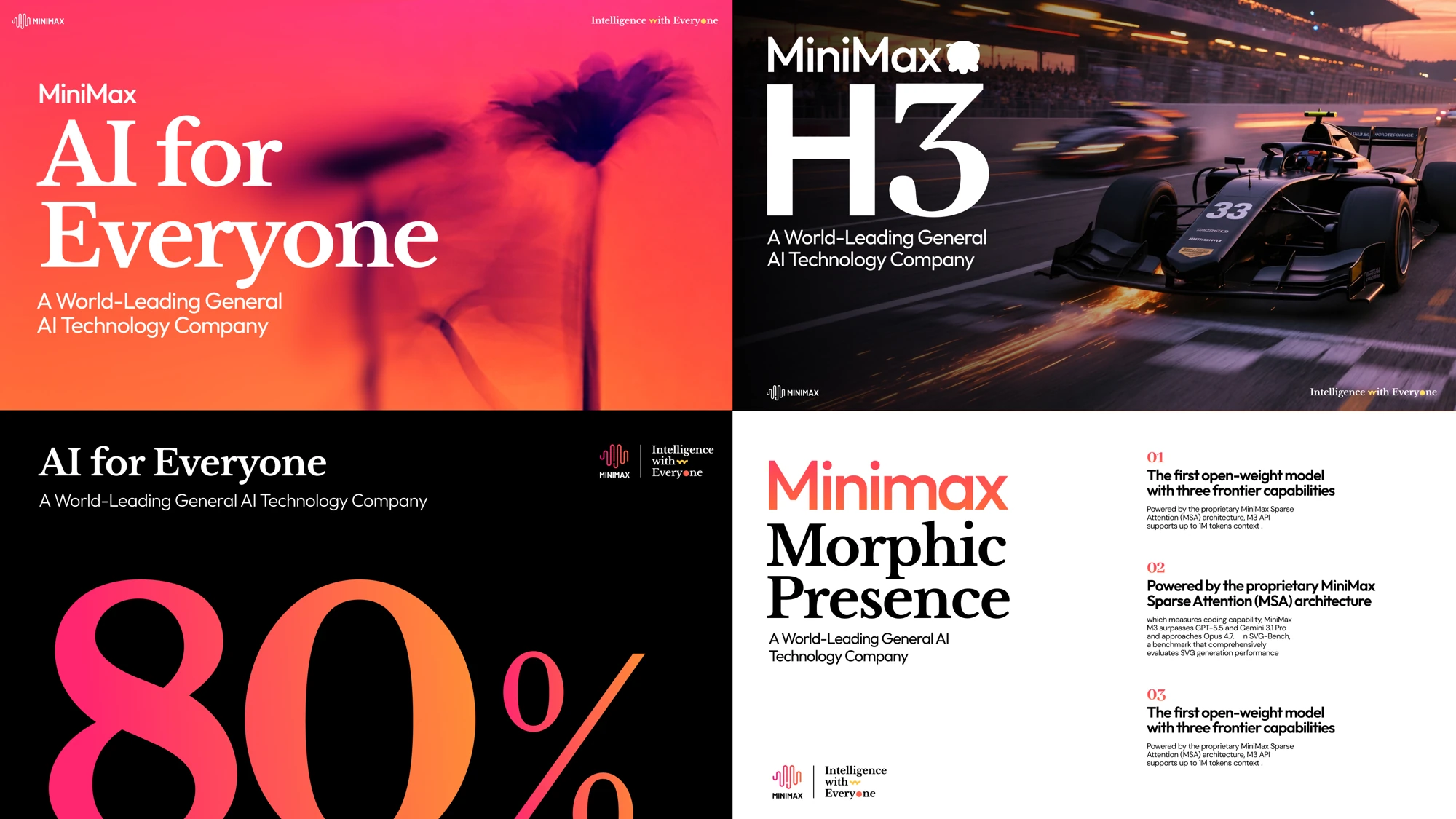
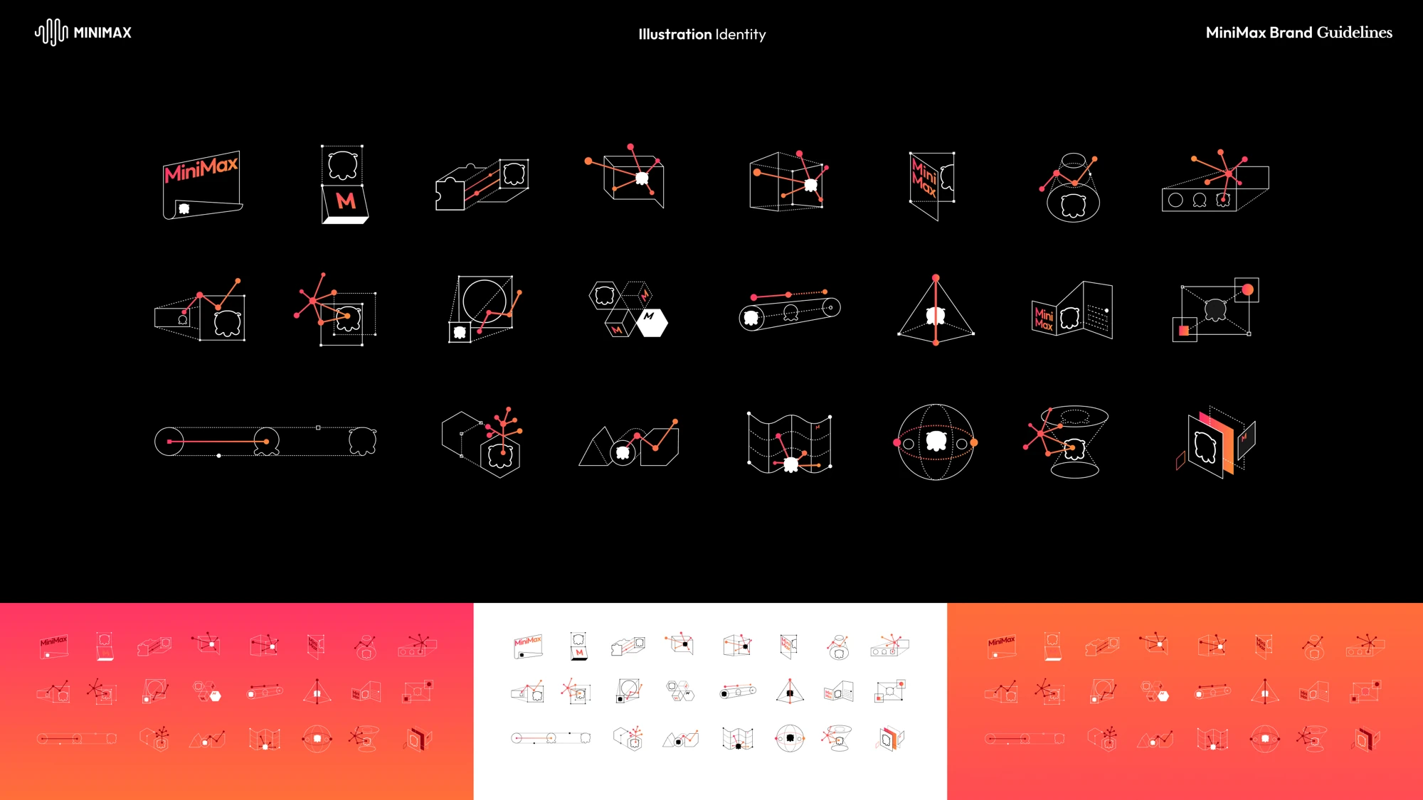
The illustration system combines modular geometry, dynamic lines, and character elements to create a flexible and organic visual language. Evolving across different forms and compositions, it brings a sense of intelligence, vitality, and continuous growth to every expression of the MiniMax brand.
Brand In Used
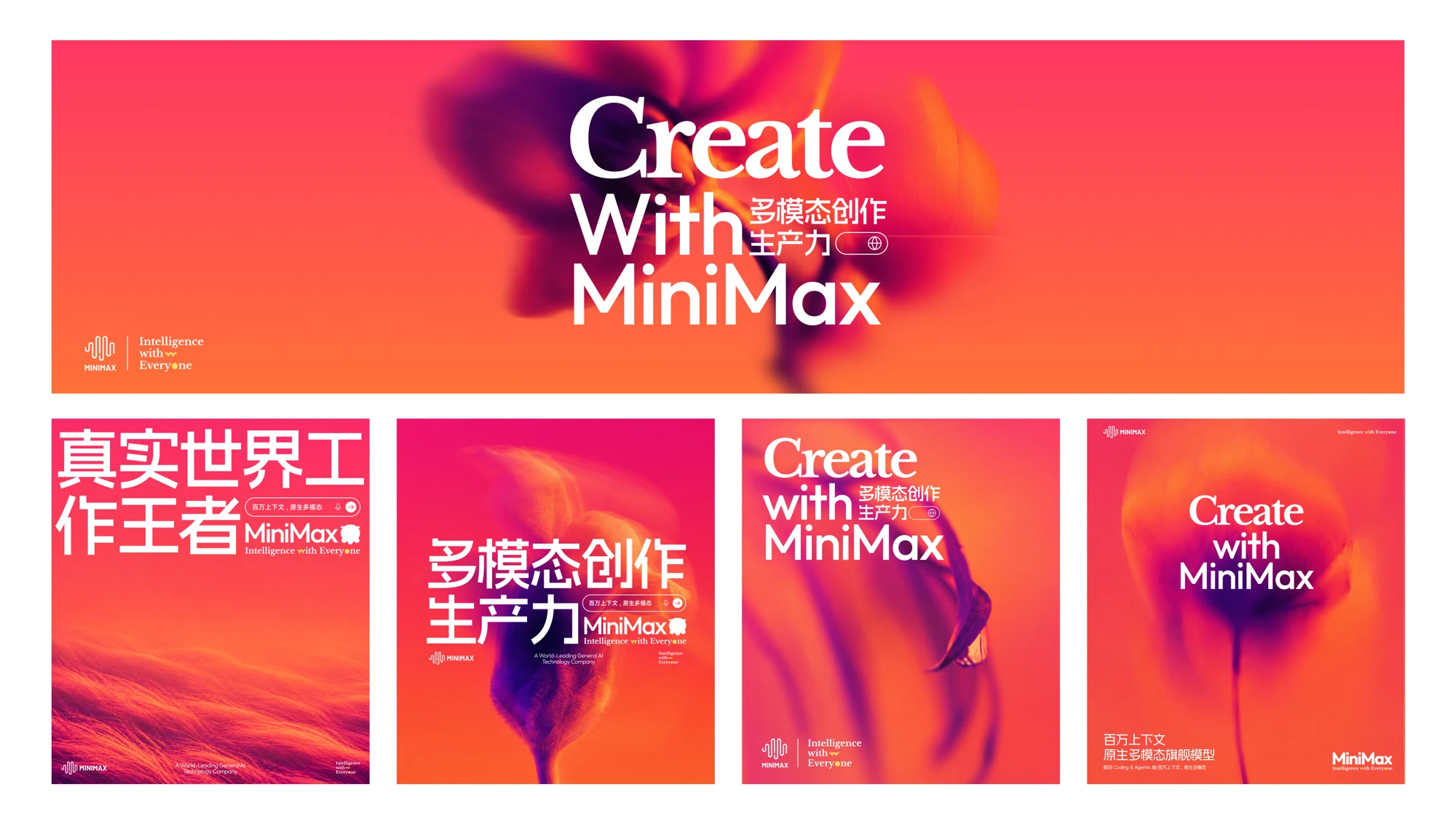
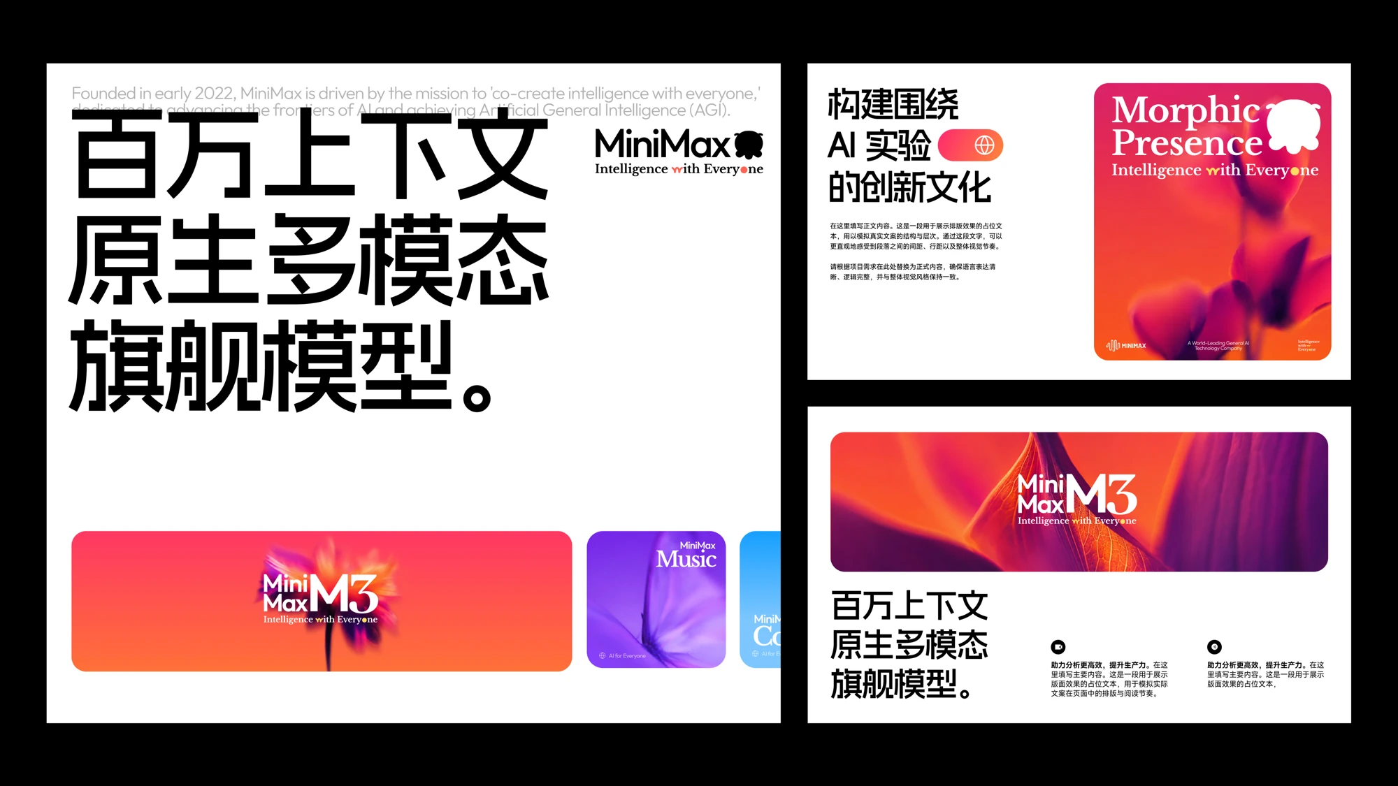
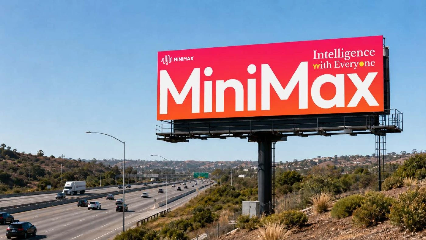
Across every touchpoint, MiniMax brings its visual language to life through bold color, fluid forms, and adaptive compositions. From physical spaces to digital interfaces, the brand remains consistent yet dynamic, expressing intelligence as something organic, evolving, and full of vitality.
Credits & Acknowledgments
Created in collaboration with builders, thinkers, and explorers.
This brand evolution was initiated by the MiniMax Brand Team and brought to life together with the MiniMax Design Team and our development teams. We sincerely thank everyone who contributed their ideas, expertise, and effort to shaping the MiniMax brand.
Contact Us
For legal inquiries, please contact MiniMax.Design@minimaxai.com.
For all other inquiries, including permission requests for the use of MiniMax logos and brand assets, questions regarding these guidelines, or uses not specifically covered herein, please contact partnercomms@minimaxai.com.
Usage terms
All visual identity assets described in these guidelines, including names, logos, wordmarks, colors, graphic elements, icons, typography, layouts, imagery, and related design elements, form part of the MiniMax visual identity system and remain the property of their respective rights holders.
Any individual, team, partner, supplier, or third party using these assets must follow the specifications defined in these guidelines, including requirements relating to proportion, color, spacing, composition, placement, and application. Brand assets may not be altered, distorted, separated, redesigned, sublicensed, or used in any way that may cause confusion, misrepresentation, inappropriate association, or damage to the MiniMax brand.
Unless otherwise expressly authorized, permission to use these assets is limited, non-exclusive, and non-transferable. No ownership or intellectual property rights are transferred through their use. Any application or scenario not specifically addressed in these guidelines should be reviewed and approved prior to use.
These guidelines may be updated periodically. Users are responsible for following the latest version and making any necessary adjustments within a reasonable period. MiniMax reserves the right to review the use of its visual identity assets and may require any non-compliant materials to be corrected, removed, or discontinued.
These guidelines are intended solely to support the consistent use and management of the MiniMax visual identity system. They do not constitute a transfer of intellectual property rights, a commercial license, or any other proprietary rights.